Interactive Design - Project 1: Prototype Design
17 Apr 2023 - 08 May 2023 (Week 4 - Week 6)
Vincent Lee // 0359386
Interactive Design // Bachelor of Design (Hons) in
Creative Media // Taylor's University
Project 1: Prototype Design
- Develop a few wireframes or mock-up of the landing page design. Develop the
landing page prototype using any prototype software of based on our preference
(Figma or Adobe XD).
redesign website: online repository of MIT's Center
supporting material(s): MIT ACT Special Collection
The rationale for selecting this particular website was that it presented both easy and challenging aspects. On one hand, the absence of an established context made it relatively simple for me to experiment and explore different design options. On the other hand, the scant amount of content provided in the current landing page posed a difficulty as it was not a business or blogging site, making it harder for me to determine which contextual elements to include.
After consulting with Mr. Shamsul, we have decided to redesign the website for
Paradise Drinking Water. The user interface was chaotic and requires a
significant transformation. Therefore, I was encouraged to change the website,
which would also benefit me in discovering how website interfaces impact user
experience.
As illustrated in Figure 1.5, I
have categorized each wireframe into different layers to make them more easily
manageable. I believe my layouts are simple, as I am in the process of
exploring and gaining experience in web design. Therefore, while creating my
wireframes, you can see that I used many grey-coloured rectangle tools to help
me with the spacing between columns and content, as depicted in
Figure 1.6.
Following the approval of wireframes 1, 2, and 5, I am now required to
commence work on the prototype based on the approved wireframes. I will be
using either Adobe Xd or Figma to construct the prototype. It is worth noting
that I am only required to produce a single prototype as the final output.
Week 4
To ensure that your visitors understand why your product or service is appealing, your landing page needs to communicate your USP in a concise manner. This can be achieved by using a series of page elements that tell the story of why your offering is unique:
It's important to understand the distinction between a feature and a benefit. A feature is a specific characteristic of your product or service, whereas a benefit explains the positive impact that the feature has. For instance, while the ice-cold temperature of your lemonade is a feature, the fact that it keeps you cool on a hot day is the benefit.
There are two important best practices to keep in mind when it comes to
leveraging social proof, which is arguably one of the most powerful tools at
your disposal.
First and foremost, it's crucial to remember that you cannot fake social proof. If people sense that something is amiss, it can be difficult to regain their trust. Thus, it's important to ensure that any social proof you provide is genuine and truthful.
Secondly, it's essential to be specific with your social proof. Whenever possible, provide details such as who, what, when, why, and how of your customer's experience. Testimonials are most effective when prospects can relate to the person providing them, so it's crucial to provide relatable and specific examples.
There are two types of call-to-action elements in digital marketing:
standalone buttons on clickthrough pages and lead generation forms on landing
pages. The standalone button directs users to another page, while the form
collects information from users. Both require clear and compelling design and
copy to be effective.
INSTRUCTIONS
Project 1:
Prototype Design
Lecture
Class summaries and lectures are recorded
here.
Instructions
MIB
<iframe
src="https://drive.google.com/file/d/1QC8REytwzPwV8bgIK6fwXMxF1UDrmN36/preview"
width="640" height="480" allow="autoplay"></iframe>
Project 1: Prototype Design
- Choose an existing website with design problems, then identify the
areas that need improvement by analysing the usability and design issues
such as evaluating the navigation, layout, typography, colour scheme, or any
other elements that may improve the user experience as it is crucial for
making a good first impression.
Task Requirements
- a clear and concise headline that describes the purpose of the website.
- landing page size width is 1366 pixels.
- Mediums: Figma or Adobe XD.
- include a call-to-action (CTA) button
- visually appealing and easy to navigate.
- The landing page shouldadhere to web design best practices, including accessibility and usability.
1) Identifying Design Issues
Select 2 to 3 websites, and craft a report detailing the topics that we have
examined based on their landing pages. After identifying the problem areas,
we will need to communicate our discoveries and proposed remedies to Mr.
Shamsul via email or another suitable method.
Figure 1.1 - evaluating websites landing page design issues_pdf, Week 3
(17 Apr 2023)
2) Wire Frame [Mock-Up]
- Visual Explorations

|
| Figure 1.2 - visual references in Pinterest, Week 4 (24 Apr 2023) |
After receiving feedback on the evaluation of websites, I used Pinterest to
conduct visual references. I analyse the elements, arrangement, and the
placement of information hierarchy.
- Layout Explorations
Week 4 Attempt

|
| Figure 1.3 - wire framing: adobe illustrator workspace (failed attempt), Week 4 (24 Apr 2023) |
I employed the rectangle tool and opened the guides in Adobe Illustrator to
establish the spacing, which also aids in maintaining consistency and
ultimately enhancing the user experience.
The rationale for selecting this particular website was that it presented both easy and challenging aspects. On one hand, the absence of an established context made it relatively simple for me to experiment and explore different design options. On the other hand, the scant amount of content provided in the current landing page posed a difficulty as it was not a business or blogging site, making it harder for me to determine which contextual elements to include.
|
Figure 1.4 - Landing Page Redesign (failed
attempt)_pdf, Week 4 (24 Apr 2023) |
Week 5 Attempt

|
| Figure 1.5 - (revised wire framing) adobe illustrator workspace, Week 5 (01 May 2023) |
redesign website: Paradise Drinking Water

|
| Figure 1.6 - progressions: using rectangle tool to determine spacing, Week 5 (01 May 2023) |
Figure 1.7 - (revised wire framing) Landing Page
Redesign_pdf, Week 5 (01 May 2023)
3) Prototype
- Chosen Layout

|
| Figure 1.8 - chosen layout: wire framing #2, Week 5 (01 May 2023) |
- Chosen Website's Landing Page

|
| Figure 1.9 - chosen website's landing page, Week 5 (01 May 2023) |
- Mood Board

|
| Figure 1.10 - organising my ideas, Week 5 (06 May 2023) |
I am currently in the process of redesigning a drinking water company that
targets households. In light of this, I believe that a simple and clean design
would be best suited for this project. Therefore, I have asked ChatGPT to
recommend several fonts that are easy to read and suitable for all audiences.
After considering several options, I have selected Open Sans, which has a
variety of font weights and sizes that can be used to create contrast.
When it comes to water, blue and white are the colors that come to mind. However, using a black font would be too plain and uninteresting, so I have decided to use a deep shade of blue for the title and text. The other two colors will be used for the Call-to-Action button. Before beginning this task, my biggest concern was how to style the redesign website, as there are different layouts and content requirements for different target markets. Ultimately, I have opted for a simple and friendly design, as the target market is middle-to-low income households, and an approachable and homely style would be best suited for this audience.
Placing my wireframe on the side and top of the frame allows me to based on my initial idea on creating the layout. However, there are unpredictable issues where I decided to add/ remove some contents and adjustment on the spacing, thus it was kind of time-consuming where I have better idea but still being hard headed to based on the wireframe created, continue on my prototyping design.
It's commonly said that plans often fail to keep up with changes. When I was
creating the website, I decided to deviate from the wireframe plan and
incorporate what I believed was best into my initial prototype design.
When it comes to water, blue and white are the colors that come to mind. However, using a black font would be too plain and uninteresting, so I have decided to use a deep shade of blue for the title and text. The other two colors will be used for the Call-to-Action button. Before beginning this task, my biggest concern was how to style the redesign website, as there are different layouts and content requirements for different target markets. Ultimately, I have opted for a simple and friendly design, as the target market is middle-to-low income households, and an approachable and homely style would be best suited for this audience.
- Progressions
First Attempt

|
| Figure 1.11 - creating column with guides, Week 5 (06 May 2023) |

|
| Figure 1.12 - placing images and adjust spacing, Week 5 (06 May 2023) |
Placing my wireframe on the side and top of the frame allows me to based on my initial idea on creating the layout. However, there are unpredictable issues where I decided to add/ remove some contents and adjustment on the spacing, thus it was kind of time-consuming where I have better idea but still being hard headed to based on the wireframe created, continue on my prototyping design.

|
| Figure 1.13 - comparison of wireframe and prototype, Week 5 (06 May 2023) |
This decision was influenced by an article shared by Mr. Shamsul in week 4
called The Anatomy of Landing Page. The article emphasised the importance of
highlighting the company's Unique Selling Products (USP), hero image, features
and benefits, social proof, and call-to-action button.
As a result, in the second column, I added the features of the drinking
company along with reworded text introducing their company. Additionally, I
adjusted the placement of the client testimonials from the wireframe plan
after conducting research that indicated displaying three testimonials
horizontally would be difficult to read, so I opted to place them vertically
instead.

|
| Figure 1.14 - prototype design (failed attempt)_jpeg, Week 5 (07 May 2023) |
Revised Attempt (after consulting with Mr. Shamsul)

|
|
Figure 1.15 - Headline and Navigation: attempt 1 (left), revised attempt (right), Week 5 (08 May 2023) |
Amendment that are made:
- Logo and navigation bars have placed slightly upper, thus it does not feels empty on the top
- CTA button added
- Revised on the font size

|
|
|
Amendment that are made:
- revised on the font colour, weight and size
- aligned the content to the columns by turning on the layout grid

|
||
|
Amendment that are made:
- Shifting of CTA buttons
- All text were right aligned
- revised on the font colour, weight and size

|
|
Figure 1.18 - Sign Up: attempt 1 (left), revised attempt (right), Week 5 (08 May 2023) |
Amendment that are made:
- aligned the content to the columns by turning on the layout grid
- revised on the font colour, weight and size
- added of logos (Google and Apple)

|
|
Figure 1.19 - Location for Availability: attempt 1 (left), revised attempt (right), Week 5 (08 May 2023) |
Amendment that are made:
- aligned the content to the columns by turning on the layout grid
- revised on the font colour, weight and size

|
|
Figure 1.20 - Testimonials: attempt 1 (left), revised attempt (right), Week 5 (08 May 2023) |
Amendment that are made:
- centred align the content to the columns by turning on the layout grid (each took 4 columns)
- revised on the font colour, weight and size
- adjust the placement of ratings (star) and changed of colours
|
|
|
Figure 1.21 - Footer: attempt 1 (left), revised attempt (right), Week 5 (08 May 2023) |
Amendment that are made:
- revised on the font colour, weight and size
- revised on the size of icons
- middle aligned all the content
Figma Workspace
Figure 1.22 - Figma Workspace, Week 6 (08 May 2023)
Final Project 1: Prototype Design
- JPEG

|
| Figure 1.23 - Project 1: Final Prototype Design_jpeg, Week 6 (08 May 2023) |
- PDF
Figure 1.24 - Project 1: Final Prototype Design_pdf, Week 6 (08 May 2023)
- PPT
Figure 1.25 - Project 1: Prototype Design Progressions_slides, Week 6 (08 May 2023)
- Outline Grids & Layout Grids
Figure 1.26 - comparison: outline & layout grids_pdf, Week 6 (08 May 2023)
Feedback
- Fig 1.1 - Evaluation of Websites (consult through email)
The analysis of both websites is clear. Suggested to include suggestions on
what to improve on. Allow to choose either one of the website because
both have a lot of issues.
To ease my uncertainty and other negative feeling, I had conducted research and gather inspiration from senior's work, Pinterest and other art galleries' landing pages. Look for examples of effective designs and note what elements they include. This gave me minimal ideated direction of what works well and what might be missing from my own design.
Week 5
- Fig 1.3 - Landing Page Redesign
Based on the feedback provided, it appears that there are a few areas that
need improvement. Firstly, when creating wireframes, it's important to focus
on the desktop version and not worry about creating a wireframe for the mobile
version. Additionally, it would be beneficial to review the article on Landing
Page Anatomy to ensure a clear understanding of the anatomy, including the
inclusion of navigation or menus on top. Also, it's important to choose a
website for redesigning the landing page that is not well designed and has
usability issues. Finally, it's crucial to remember that all websites must
have a navigation, as it is a basic element for any website, and to consider
other elements that contribute to a successful landing page, as outlined in
the article.
- Fig 1.7 - (revised) Landing Page Redesign
My wireframes are looking good. But Mr. Shamsul questioned what I mean by
adding icons on some of the wireframes. At the end, I can can proceed with
either wireframe 1, 2 or 5.
Week 6
- Fig 1.14 - prototype design attempt #1
Week 6 Feedback
Week 9
- Fig 1.24 - final prototype design
Your overall performance is good. You're on the right track, but not quite there yet. Your Project 1 can be improved. You need to explore more by looking at other good design example and try to implement it in your design
Reflection
*reflection are recorded in a weekly basis.
Week 3
When it comes to listing out issues, it can be quite challenging to translate
my thoughts and feelings into words, as sometimes I may struggle to express
our ideas clearly and accurately. Moreover, choosing a website to evaluate for
redesign can also be a daunting task, as it requires me to envision potential
improvements and consider what changes could be made. It's easy to get stuck
in indecision and spend a lot of time selecting the right website to work on.
Fortunately, I still able to catch up the weekly progressions and submit it
for feedback on time. Hope everything can run through smoothly.
Week 4
I feel uncertainty and dissatisfied as I am not confidence with my working on
redesigning the selected website. Maybe is due to that my first time doing
this, thus I keep tangling what to include on the landing page. Moreover, due
to public holidays the lessons are not conducted as planned in the MIB, thus
make me more insecure and frustrated as I don't have anyone to turn to for
guidance. To ease my uncertainty and other negative feeling, I had conducted research and gather inspiration from senior's work, Pinterest and other art galleries' landing pages. Look for examples of effective designs and note what elements they include. This gave me minimal ideated direction of what works well and what might be missing from my own design.
Week 5
I'm feeling incredibly frustrated right now because I'm up against a tight
deadline for the landing page design, and I'm being forced to start the whole
process over again. On top of that, I have to completely reevaluate the
website's elements, figure out the best arrangement and placement for all the
information, and then decide whether to consult with Mr. Shamsul about wire
framing before creating the prototype, or just dive right in and risk having to
make last-minute alterations. It's all quite overwhelming.
After days of procrastinate and struggles, I finally able to complete my new
wireframes of the new selected website and receive feedback from Mr. Shamsul.
It was so rushed [sobbing]. After days of struggles, I finally completed my
prototype design, hoping Mr. Shamsul and Ms. Dini will give their best advises
and like my design.
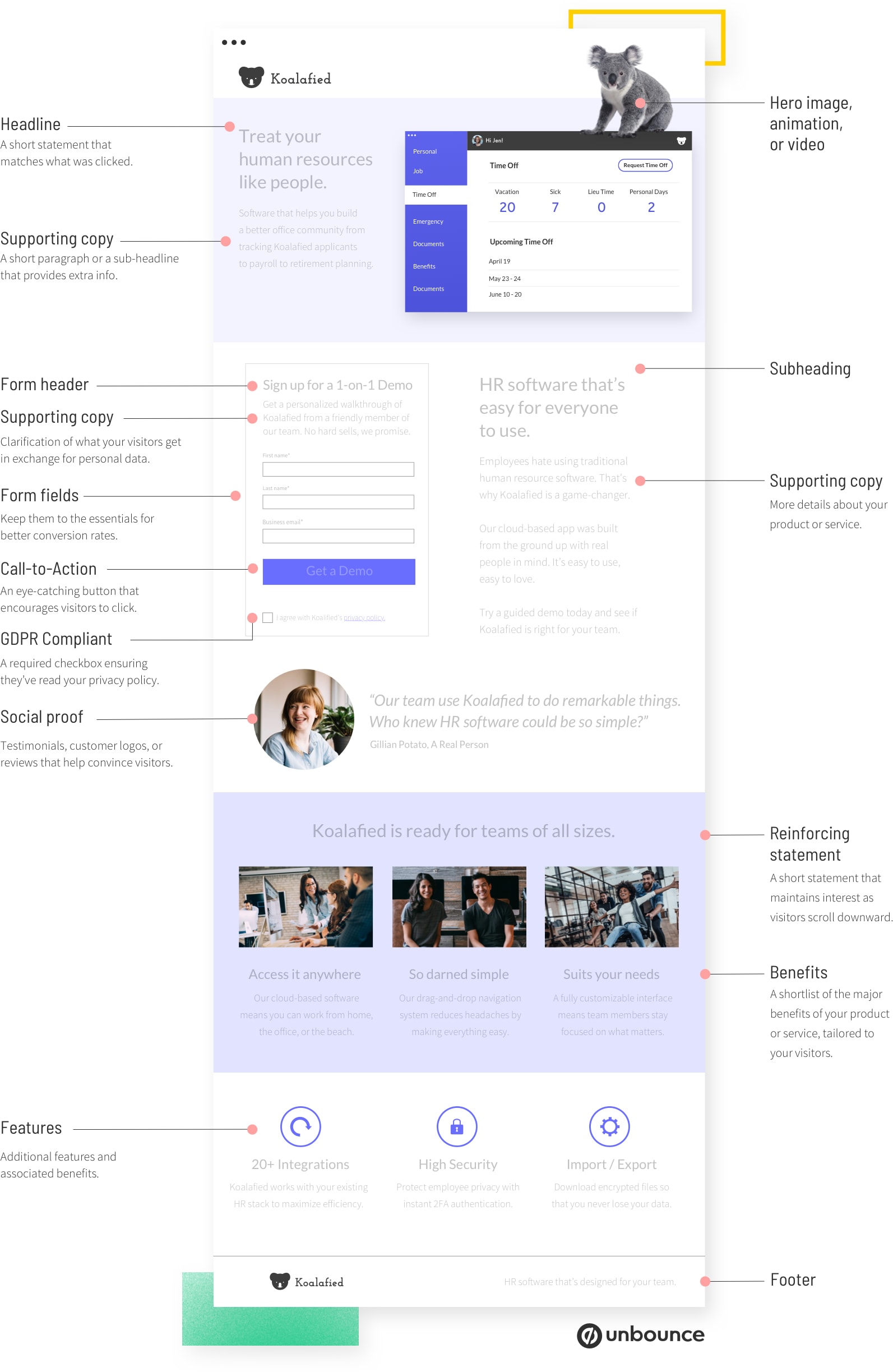
Further Reading

|
| Figure - The Anatomy of Landing Page: Anatomy Illustration |
Reference:
The Anatomy of a Landing Page [Includes Illustrations]. (n.d.).
Unbounce. Retrieved May 1, 2023,
Components of a Landing Page
1. Unique Selling Proposition (USP)
Your unique selling proposition (USP) is what sets your product or service
apart from the competition. It's the "sizzle" that answers the question of
why your offer is so special. Instead of getting stuck on the idea of being
completely "unique," think of your USP as how you position your offering as
better and different from everything else.
To ensure that your visitors understand why your product or service is appealing, your landing page needs to communicate your USP in a concise manner. This can be achieved by using a series of page elements that tell the story of why your offering is unique:
- The main headline
- A supporting headline
- A reinforcing statement (optional)
- A closing statement (optional)
2. The Hero Image
Hero image here is referring to the background video, where also the first
visual element who will appear when users are on our landing page.

|
| Figure - a sample of hero image retrieved from Pinterest |
3. Benefits
To convince the majority of people, your landing page requires additional
supporting text beyond the headline. The crucial aspect is to not only
mention the features of your product or service, but also to describe the
specific benefits they offer.
It's important to understand the distinction between a feature and a benefit. A feature is a specific characteristic of your product or service, whereas a benefit explains the positive impact that the feature has. For instance, while the ice-cold temperature of your lemonade is a feature, the fact that it keeps you cool on a hot day is the benefit.

|
| Figure - Touch Bistro, a point of sale system for restaurants, cleverly turns complicated features into situational benefits. |
4. Social Proof
On a landing page, social proof takes many forms:
- Direct quotes from customers
- Case studies (or links to case studies)
- Video interviews or testimonials
- Logos of customer companies
- Review scores from sites like Yelp, Amazon, or Capterra

|
| Figure - using social proof to drive more conversions by Unbounce |
First and foremost, it's crucial to remember that you cannot fake social proof. If people sense that something is amiss, it can be difficult to regain their trust. Thus, it's important to ensure that any social proof you provide is genuine and truthful.
Secondly, it's essential to be specific with your social proof. Whenever possible, provide details such as who, what, when, why, and how of your customer's experience. Testimonials are most effective when prospects can relate to the person providing them, so it's crucial to provide relatable and specific examples.
5. A Conversion Goal (Your Call to Action)

|
| Figure - illustration of Call-to-Action (CTA) button by Animoto |
To create effective CTAs, there are three fundamental tips:
- Avoid generic text like "CLICK HERE" or "SUBMIT." Instead, use conversational language and clearly state what the visitor will get for clicking ("START MY FREE TRIAL" or "GET 50% OFF YOUR PURCHASE").
- Keep forms as short as possible and provide a privacy statement to reassure visitors that their data is secure. (and to comply with GDPR regulations).
- A/B testing can help optimize your CTAs since even small differences can have a significant impact on conversion rates. You can read more about that here.
Quick Links
Project 2: Working Web Page
Final Project: Design, Exploration and Application

