Typography - Task 1: Exercise 1 & 2
30 Aug 2022 - 26 Sept 2022 (Week 1 -Week 5)
Vincent Lee // 0359386
Typography // Bachelor of Design (Hons) in Creative Media // Taylor's
University (TDS)
Task 1: Exercises (Text Expression and Text
Formatting)
Instructions
Exercise 1: Type Expression
Exercise 2: Type Formatting
Feedback
Reflection
Further Reading
Lecture 2: Typo_1_Development
Lecture 3: Typo_2_Basic
Lecture 4: Typo_2_Text_P1
Lecture 5: Typo_3_Text_P2
Lecture 6: Typo_5_Understanding
Lecture 7: Typo_6_Screen&Print
Week 1
Class Summary 1
Mr. Vinod showed us how to use the Typography Facebook group and create an e-portfolio using a YouTube video. He also gave us advice on how to succeed in his class by explaining the dos and don'ts in the Module Information Booklet. Mr. Vinod suggested that we read not only our own feedback but also feedback given to others. This will help us improve and learn more. He then gave us the first task, TYPE EXPRESSION, and briefly mentioned future tasks. Finally, Mr. Vinod recommended design blogs and pages such as Kreatif Beats for us to explore and learn more about design.
Exercise 1: Type Expression
Exercise 2: Type Formatting
Feedback
Reflection
Further Reading
LECTURES
LECTURE LIST
Lecture 1: Typo_0_Introduction Lecture 2: Typo_1_Development
Lecture 3: Typo_2_Basic
Lecture 4: Typo_2_Text_P1
Lecture 5: Typo_3_Text_P2
Lecture 6: Typo_5_Understanding
Lecture 7: Typo_6_Screen&Print
Class Summary 1
Mr. Vinod showed us how to use the Typography Facebook group and create an e-portfolio using a YouTube video. He also gave us advice on how to succeed in his class by explaining the dos and don'ts in the Module Information Booklet. Mr. Vinod suggested that we read not only our own feedback but also feedback given to others. This will help us improve and learn more. He then gave us the first task, TYPE EXPRESSION, and briefly mentioned future tasks. Finally, Mr. Vinod recommended design blogs and pages such as Kreatif Beats for us to explore and learn more about design.
The Evolution:
Calligraphy → Lettering → Typography
Font: a font refers to the individual font or weight with the typeface.
Typeface: a typeface refers to the entire family of fonts/ weights that
share similar characteristics/ styles.
1. Early Letterform Development:
- Phoenician to Roman

Pheonician to Roman

Evolution from Phoenician Letter
- Writing Direction:

Boustrophedon (ox ploughs)
(by EndeavorCareers)
- Etruscan
draw with paint brush, and based on the skillset at the paint brush they have, they will developed this stroke based on the tools they using, and as the results we have the letterform we see today.
.jpg)
Etruscan Civilisation (by Speedy Gonsales)
- Square Capitals
Starting to use pen, with a broader edge, and have a slant to the tools being used, as the results, development of the thick and thin stroke and of course serifs was added.
Starting to use pen, with a broader edge, and have a slant to the tools being used, as the results, development of the thick and thin stroke and of course serifs was added.
 |
| 4th/ 5th century - Square Capital |
- Rustic Capitals
similar to Roman square capitals, but are less rigid, influenced more by pen and ink writing. Condensed letter is always a lot more difficult to read than letter that are lot more proportionate like square right.

Late 3rd - Mid 4th Century - Rustic Capitals
- Roman Cursive
Lowercase is the results of writing fast. It was the everyday form of handwriting used for writing letters, by merchants writing business accounts, by schoolchildren. Cursive was used for quicker, informal writing.New Roman Cursive - uses letterforms that are more recognizable to modern readers: "a", "b", "d", and "e" have taken a more familiar shape, and the other letters are proportionate to each other rather than varying wildly in size and placement on the line.

4th century - Roman Cursive
- Uncials
Elements of uppercase and lowercase integrated to the writing system.

4th - 5th century - Unicials
Formal lowercase letterforms . One of the scripts that emerged from the New Roman Cursive.


- Blackletter to Gutenberg’s type (Blackletter Textura)
.png)

C. 500 - Half Unicials
- Charlemagne (Caroline Minuscule)
Developed to standardised writing system, and to convey message accurately and precise.

C. 925 - Caroline Minuscule
People eventually developed their own styles, our surroundings/ nature has an impact, people’s characteristics has an impact on the way we write.
.png)
C. 1300 - Blackletter (Textura)
Who is Gutenberg?
- He developed a mechanism where
printing can be done much more quickly rather than documenting the
information.
- His major work, the Gutenberg Bible (also known as the 42-line Bible), was the first printed version of the Bible and has been acclaimed for its high aesthetic and technical quality.
- His major work, the Gutenberg Bible (also known as the 42-line Bible), was the first printed version of the Bible and has been acclaimed for its high aesthetic and technical quality.
3. History
1. Nicholas Jenson - Humanist Script to Roman type
2. Francesso Griffo - Venetian Type from 1500
3. Garamond 1521 - The Golden Age of French Printing (digitising)
4. Christophe Plantin - Dutch Printing, C. 1600
5. Caslon - English type from the 18th Century
6. Baskerville and Badoni - Baskerville's Innovations - from handwriting to digitisation
7. Bauhaus (1923) - 19th Century types
8. Muller-Brockman - Modernist Typography - 1959
4. Text type Classification

1450 – Blackletter
1475 – Oldstyle
1500 – Italic – condensed and close set, allowing more words per
page
1550 – Script – not recommend for large amount of text
1750 – transitional – Badoni and Baskerville – not need for
handwritten text, due to advance in casting and printing
1775 – Modern – serifs were unbracketed, and the contrast
between thick and thin stokes extreme.
1825 – Square Serif/ Slab Serif – heavily bracketed serif for
commercial printing
1900. – Sans(no) Serif – sans serif = grotesque (ugly)
1990 – Serif/ Sans Serif
Week 2
We were asked to upload our sketches to our blog and arrange it according the sequences. We share screen one after another to receive feedback from Mr. Vinod regarding our first tasks. The whole process takes roughly one and a half hour to complete. The feedbacks from Mr. Vinod to me is considerably unpleasant because he not recommend me to use the outline of something to express the word. He want us to design something that able to communicate just using the letter font. After a short break, Mr. Vinod show us a few design from other classes, and he teaches us some techniques to cope with Adobe Illustration, because a few of us are strange to this application. After that, we started our practical class by embedding the sketches into the artboard provided by Mr. Vinod. I have no idea how I am going to complete this, but I will try my best.
- We were advised to choose a type
family that have a good range of type faces.
- Lexicon = Terminology
- Capital letter are smaller than the
ascending strokes of lowercase, this is because capital letter are
generally wider and have most surface area on the top.
- uppercase and lowercase are in the same size but different
visual impact.
- not all font have lowercase numerals
- cannot find Italic in small capital letter
- Italics means handwriting
- Oblique means not handwriting
- Despite the era that produced them is still in use today because it
is so well-designed. A well designed typeface doesn't have very
strong character. In fact, all well-designed typefaces are
somewhat ambiguous, they can fit intone different type of situation and
purposes. It lengthen the survival period over the time.
- From the video, Mr. Vinod stated that the reason he
limits the choices of typefaces to be used is to allow us to be able to
focus on the basic understanding of typography before discover more of
the typefaces.
Week 3
Mr. Vinod review and give feedback for our digitise type expression. While waiting for the feedback, of my design, I listen to other's feedback to enhance my knowledge. In today class, Mr Vinod teaches us to give regards to the overall visual impact when creating an artwork, this is because it is the impression that people receive within their first sight. Thus, we are asked to adjust the artwork within the four artwork to gain visual impact and always question ourself whether the artwork is presentable, are they create balance. In addition, I had learned that when using font that have a lot of character, that imbibe the communication plus if the font is decorative, due to this, the decorative aspects of the font come stronger oppose to the meaning of the word. During the tutorial class, we are given thirty minutes to refine the mistakes and flaws of our design til it perfect and we were asked to watch a pre-recorded video to learn to animate one out of four of our digitise design. Before starting the process to animate our type expression, Mr. Vinod brief us some mistakes of our seniors. We were advised to sketch what we intend to do with the expression because we need to properly reflect the expression. Then, we started to create a rough and short gif animation during the practical class. We share screen our gif after the time frame given and receive feedback accordingly.
Typo_2_Text_Part 1
1. Tracking: Kerning and Letter Spacing
- Kerning
One letter invading the space of the other letter, applying on headlines or if will be time consuming to adjust the space between letters.
- Letter Spacing
Adding of space between two letters
- Tracking
The addition and removal of space in a word or sentence. The increase of spacing reduce the readability of the texts. Tight tracking makes the audience difficult to decipher the texts visually.
- The grey value
Refers to the text itself. If the greyness is too dark means, there is not enough reading. Otherwise, it the grey is too light, it means it is given too much letter spacing or letter.
2. Formatting Text
- Flush Left
Always have ragging (jagged edge/ end point of the left aligned text) on the right.
- Centered
Will be difficult to read if the texts are too long, as the starting point is irregular, it will not make a good reading experience. It should be used for small amounts of copy or text.
- Flush Right
Good when applying to create some poster or under an image (with small amount of text) or maybe an axial layout, where we are free to adjust the alignment (left, centered, and right)
- Justified
presented the texts orderly and provide more readability to the audience. Gaps = rivers, therefore who is learning especially Typographer, are advised to avoid at all costs
3. Texture
It is crucial for a typographer to select an appropriate typeface to convey the message, as some typeface is created for screen reading purposes, while some might not create for those purposes.
3. Texture
It is crucial for a typographer to select an appropriate typeface to convey the message, as some typeface is created for screen reading purposes, while some might not create for those purposes.
4. Leading and Line Length
- Type size will be print and chose at that point size to achieve readability.
- Leading is the space between each line of text. It is decided on the vertical eye movement of the reader or the gray value or the color.
- Generally, about 2 to 3 points of leading. For instance, if we have a 9-point typeface, then plus 2 we will get 11, then the leading will be 11.
Week 4
Class Summary 4
In class, Mr. Vinod reviewed our animation projects and gave us feedback. We had an hour to make improvements and then upload the final versions of our digital type expressions and GIFs in JPEG and PDF format to our blogs. We were also reminded to watch the pre-recorded lecture videos on YouTube for Task 2: Text Formatting, as this is a prerequisite for attending the typography class. Mr. Vinod pointed out some mistakes in our portfolios and emphasized the importance of watching the videos to gain a basic understanding of the topics covered in class. During the practical class, he taught us about kerning, tracking, margins, and creating dynamic margins. He also demonstrated shortcuts and shared his expectations for completing tasks.
Typo_3_Text_Part 2
6. Indicating Paragraphs Space
- Pilcrow (¶)
Used to indicate paragraph spacing
- Cross Alignment
- Cross Alignment
By ensuring the leading and the paragraph spacing has equal value, we will need to ensure cross alignment.
- Indentation
- Indentation
Used to save space and printing cost. It is best use with justified.
7. Widows and Orphans (things that should never occur in our designs)
- Widow: A single word at the end of the paragraph/ a column of text.
- Orphan: last line of previous column
- Shift + enter – forced line break symbol
- Option + left Arrow Key – kerning/ letter spacing (up to 3 times only)
8. Highlighting Text
- Using Italics
- Increase the boldness or the weight of the text by making it bold or medium
- Placing a field of colour at the back of the text
- Quotation mark
9. Headline within Text
- Typographic hierarchy of information, to reduce the confusion when people are reading.
- A heads create a clear break between the topics within a section.
- B heads indicate a new supporting argument, using forced line breaks, following the leading space.
Week 5
Class Summary 5
In class today, Mr. Vinod reviewed our Text Formatting exercise and gave feedback. He advised that Futura needs more leading when used for a large amount of text and Bodoni is not suitable for high amounts of text due to contrast. He suggested using 12pt or higher for long text and avoiding bold, italic, and condensed fonts for large amounts of text. We were given time to refine our mistakes in Task 1 and showcased our process work during the tutorial. Mr. Vinod briefed us on Task 2: Typographic Exploration & Communication (Text Formatting and Expression). We played Menti at the end of class and were dismissed after Mr. Vinod's speech.
Typo_5_Understanding
1. Understanding Letterforms
1. Understanding Letterforms
- Univers is versatile, can use it for virtually or anything.
- different weight in one stroke from the other allows for a sense of delicateness and dynamics
- subtle differences make a huge impact in the readability but also the outlook of the letters.
- Mr. Vinod advised to simplify our characteristics within the letter of our strokes of our letter, and it must be replicable in all the other letter form as well.
- Consistency in replicating that particular uniqueness of that feature added into our letter forms is important.
- overlay both letter A , so can see the difference in strokes and shapes and contours of both letter forms.
- Curved strokes have less space touching the median line, they tend to exceed the median line. This is due to want to make it the same size, it will look optically smaller.
- knowing the space outside of the letterform (negative space) are equally important because it aids in the readability and legibility of formatted text or letterforms.
- Before designing a typeface, it's good to analyse certain letters. For instance, by breaking down or going closer into the letter forms and looking at them at greater detail to understand how this form is constructed.
- when dealing with different set of contrast, to differentiate that information, we require contrast.
Week 6
Typo_6_Screen & Print
1. Type for Screen
- Verdana and Georgia is specifically designed for screen, cannot use on paper, because
lecturers will doubt our depth of understanding in
typography.
- More open space for typography in screen, so
there is no lumping of text information.
2. Hyperlink
- use to navigate a document that is online.
3. Font Size for Screen
- 24pt is good for screen reading.
4. Static vs. Motion
- good design is dynamic irrespective of the platform.
- Typography is fundamental across the board no matter which specialisation we are in.
INSTRUCTIONS
Module Information Booklet
<iframe
src="https://drive.google.com/file/d/1BzAYrFDRUnQhBokIGh3esOdvLEyZv6YI/preview"
width="640" height="480" allow="autoplay"></iframe>
Task 1: Exercise - Type Expression
1. Idea Sketches
For Exercise 1, we are given a set of words to choose from and to create
a type expression of the chosen words. There are six options and I had
chosen BITE, COZY, FRAGILE and DISTORT. We are limited to only the following 10 typefaces which are adobe
Caslon, Bembo, Bodoni, Futura, Gill Sans, Garamond, New Baskerville,
Janson, Serifa and Univers.

Figure 1.1 - Type Expression Ideas, Week 1 (06 Sept 2022)
In Fig. 1.1, the words I chose are BITE, COZY, FRAGILE and DISTORT. These
are my sketches drawn in my iPad, using Procreate. I labelled each of the
design and describe my ideas and concepts for each word. The font to be used
for each word will be decided afterwards.
Week 2, after received feedback from Mr. Vinod, I have to work out
again with my design for the word - BITE, COZY and FRAGILE because the
deadline is around the corner, thus I am worried about it. Fortunately,
after looking at my peers' sketches, I got more ideas to overcome the
issues.
2. Digitisation
Type%20Expression%20Progression-01.jpg)
Figure 1.2 - "Cozy" digitalisation progress, Week 2 (13 Sept 2022)
Type%20Expression%20Progression-03.jpg)
Figure 1.3 - "Fragile" digitalisation progress, Week 2 (06 Sept 2022)
Type%20Expression%20Progression-04.jpg)
Figure 1.4 - "Distort" digitalisation progress, Week 2 (06 Sept 2022)
Type%20Expression%20Progression-02.jpg)
Figure 1.5 - "Accelerate" digitalisation progress, Week 2 (06 Sept 2022)
Overall Digitalised Type Expression

Figure 1.6 - (Draft 1) Digitalised type expression, Week 2 (06 Sept 2022)
Fig. 1.6 - Following the Week 3 feedback session from Mr. Vinod. I was asked
to alter some parts that can be improved. For the word - Cozy, Mr. Vinod
advised to enlarge and change the font for letter Y. Furthermore, make the
word - Accelerate, vertically up like a rocket preparing to launch.

Figure 1.7 - (Draft 2) Digitalised type expression, Week 3 (13 Sept 2022)
Fig. 1.7 - This is the amendment that have been done after
received feedback from Mr. Vinod. I have enlarged the overall font size for
the word - Cozy. Besides, I redesigned the word - Accelerate. I change the
perspective from looking upward to the perspective of looking downward.
Final Type Expressions

Figure 1.8 - Final Type Expression - JPEG, Week 3 (13 Sept 2022)
Fig. 1.8, after I got advised from Mr. Vinod and my peers, I decided
to alter the word Accelerate again, from the perspective of looking downward
to the perspective of looking horizontally. The letter A, C, C will be
placed closely and the size are smaller than the other letters to create a
visual effects that the letters are running faster and the following letters
are chasing the letter in front of themselves. Thus, the distance of the
letters are gradually reduce to show the effect. Besides, to achieve balance
of visual impact, I had switched the placement of Accelerate and Distort so
it won't be to emphasise on one side but the whole image.
Figure 1.9 - Final Type Expression - PDF, Week 4 (20 Sept 2022)
<iframe
src="https://drive.google.com/file/d/1l4WxRD3C2C9aajqdd-A2rJsiHUV1JLDN/preview"
width="640" height="480" allow="autoplay"></iframe>
3. Type Expression Animation

Figure 1.10 - First Attempt of Animated, Accelerate - GIF, Week 3 (13 Sept
2022)
Fig 1.10, More frames needed or is just jumping up and down. The word was
placed wrongly and I am advised to start from the bottom with slow speed
then increase the speed to very fast. The reason I had chosen the word
Accelerate is because it let me think of rocket.

Figure 1.11 - Second Attempt of Animated, Accelerate - GIF, Week 3 (13 Sept
2022)
In Fig. 1.11, the direction of the word went from downward to upward, the
speed is also improved starting in slow motion then to a fast motion.
Figure 1.12 - Final Animation Timeline (17 frames), Week 4 (20 Sept 2022)
Final Animated Type Expression

Figure 1.13 - Final Animated Type Expression, Accelerate - GIF, Week 4
(20 Sept 2022)
In Fig. 1.13, I have improved the overall size and distance between each
letters. The overall now looks better and is running smoothly.
Task 1: Exercise 2 - Text Formatting
For Exercise 2, we are to create one final layout addressing different areas
of text formatting, such as kerning, leading, paragraph spacing, alignment,
etc. This exercise will help us practice and develop our skills in spatial
arrangement and information hierarchy. We are to use Adobe InDesign for this
exercise.
Kerning and Tracking Exercise
Figure 2.1 - With Kerning (left) vs without Kerning (right), Week 4 (20 Sept 2022)
Figure 2.2 -
Both with kerning and without kerning overlayed to show the difference, Week
4 (20 Sept 2022)
Layout Exercise

Figure 2.3 - Layout #1 (Left); Layout #2 (Right), Week 4 (20 Sept 2022)
Layout #1
Font/s:
Bembo Std, Semibold (Headline), Bembo Std, Italics (Byline)
HEAD

 Figure 2.5 - Layout Progress 3, Week 4 (20 Sept 2022)


1. Are the explorations sufficient?
2. Does the expression match the meaning of the word?
3. On a scale of 1–5, how strong is the idea?
4. How can the work be improved?
Week 2
Specific Feedback -
The 'heart fragile' is work, but that the letter font used to form the shape of the heart is overly distorted then it might not going to work well. Second, the problems is bite does not seems to be based on the type face provided. Third, the design for cozy is good but not sure can be work or not with the letter font, suggest to re-think again. Distort is straightforward and is find.
General Feedback -
Need to rework three of them.
Week 3
Mr. Vinod's class is both fast-paced and enriching. I vividly recall feeling nervous during our first exercise review as I watched him critique my peers' sketches. However, when he offered feedback on my work, it was a tremendous relief. I'm constantly impressed by my classmates' creative designs and innovative ideas. Mr. Vinod's passion for the subject matter is palpable and contagious, making the exercises all the more engaging. I particularly enjoy when he delves into the history of a topic, as it fosters a deeper connection to the content.
Observation


- Elaboration


The twenty-one members of the Univers family share the same x-height, capital height, and ascender and descender length and are produced as a system, they can be intermixed and used together without limitation. This gives extraordinary design flexibility to the designer.

Type Size/s:
22 pt (Headline), 12 pt (Byline)
Leading: 24 pt
(Headline), 14 pt (Byline)
Paragraph Spacing: 11 pt
BODY
Font/s:
ITC New Baskerville Std, Roman (Body Text), Futura Std, Light Condensed
(Caption)
Type Size/s: 9 pt (Body
Text), 8 pt (Byline)
Leading: 11 pt (Body Text), 10 pt
(Byline)
Paragraph Spacing: 11 pt
Characters per-line: 59 - 68 characters
Alignment: Left Aligned
Margins:
20 mm (Top), 80 mm (Bottom), 13 mm (Left & Right)
Columns: 4
Gutter: 8 mm
Layout #2
Font/s: Futura Std, Extra
Bold (Headline), Futura Std, Light Oblique (Byline)
Type Size/s:
20 pt (Headline), 8 pt (Byline)
Leading: 22 pt
(Headline), 10 pt (Byline)
Paragraph spacing: 11 pt
BODY
Font/s: ITC New Baskerville Std, Roman (Body Text), Futura Std, Light
Condensed (Caption)
Type Size/s: 9 pt (Body
Text), 8 pt
(Byline)
Leading: 11 pt (Body Text),
10 pt (Byline)
Paragraph Spacing: 11 pt
Characters per-line: 58 - 65 characters
Alignment: Left Aligned
Margins:
35 mm (Top), 80 mm (Bottom), 15 mm (Left & Right)
Columns: 2
Gutter: 8 mm

Figure 2.4 - Layout Progress 2, Week 4 (20 Sept 2022)
Layout #3
HEAD
Font/s:
ITC Garamond Std, Bold (Headline), ITC New Baskerville Std, Italic (Byline)
Type Size/s:
24 pt (Headline), 10 pt (Byline)
Leading: 26 pt
(Headline), 12 pt (Byline)
Paragraph Spacing: 11 pt
BODY
Font/s: ITC Garamond
Std, Bold Narrow (Body Text), Futura Std, Light Condensed Oblique
(Caption)
Type Size/s: 9 pt (Body
Text), 8 pt
(Byline)
Leading: 11 pt (Body
Text), 10 pt (Byline)
Paragraph Spacing: 11 pt
Characters per-line: 65 - 72 characters
Alignment: Left Aligned
Margins:
35 mm (Top), 85 mm (Bottom), 14 mm (Left & Right)
Columns: 2
Gutter: 5 mm
Layout #4
HEAD
Font/s:
Bembo Std, Semibold (Headline), Bembo Std, Italic (Byline)
Type Size/s:
18 pt (Headline), 10 pt (Byline)
Leading: 20 pt
(Headline), 12 pt (Byline)
Paragraph Spacing: 11 pt
BODY
Font/s: Bembo Std,
Italic (Body Text), Futura Std, Light Condensed (Caption)
Type Size/s: 9 pt (Body
Text), 7 pt (Byline)
Leading: 11 pt (Body
Text), 9 pt (Byline)
Paragraph Spacing: 11 pt
Characters per-line: 72 - 77 characters
Alignment: Left Aligned
Margins:
40 mm (Top), 80mm (Bottom), 15 mm (Left & Right)
Columns: 2
Gutter: 8 mm

Layout #5
HEAD
Font/s:
Bembo Std, Semibold (Headline), Bembo Std, Italic (Byline)
Type Size/s:
24 pt (Headline), 12 pt (Byline)
Leading: 26 pt
(Headline), 14 pt (Byline)
Paragraph Spacing: 12 pt
BODY
Font/s: Bembo Std,
Italic (Body Text), Futura Std, Light Condensed (Caption)
Type Size/s: 10 pt (Body
Text), 7 pt (Byline)
Leading: 12 pt (Body
Text), 9 pt (Byline)
Paragraph Spacing: 12 pt
Characters per-line: 68 characters
Alignment: Left Aligned
Margins:
40 mm (Top), 80mm (Bottom), 14 mm (Left & Right)
Columns: 2
Gutter: 5 mm
Final Task 1: Exercise 2 - Text Formatting
Figure 2.6 - Clear Layout, JPEG, Week 6 (04 Oct 2022)

Figure 2.7 - Layout with guides and grids
visible, JPEG, Week 6 (04 Oct 2022)
HEAD
Font/s: ITC New Baskerville Std, Bold (Headline), ITC New Baskerville Std, Italic (Byline)
Type Size/s: 23 pt (Headline), 10 pt (Byline)
Leading: 25 pt (Headline), 12 pt (Byline)
Paragraph Spacing: 12 pt
BODY
Font/s: Gills Sans, Regular (Body Text), ITC New Baskerville Std, Italic (Caption)
Type Size/s: 10 pt (Body Text), 8 pt (Byline)
Leading: 12 pt (Body Text), 10 pt (Byline)
Paragraph Spacing: 12 pt
Characters per-line: 57 - 62 characters
Alignment: Left Aligned
Margins: 35 mm (Top & Bottom), 12.7 mm (Left & Right)
Columns: 2
Gutter: 5 mm
Figure 2.8 - Clear Layout, PDF, Week 6 (04 Oct 2022)
<iframe
src="https://drive.google.com/file/d/1S_HuU89zd-FuzwfbSrwzR2ZCpYRb8vqg/preview"
width="640" height="480" allow="autoplay"></iframe>
Figure 2.9 - Layout with guides and grids visible, PDF,
Week 6 (04 Oct 2022)
<iframe
src="https://drive.google.com/file/d/1aNCwS9YAAEDHqE3aT5RBPA59F-RgZH_t/preview"
width="640" height="480" allow="autoplay"></iframe>
FEEDBACK
Questions:1. Are the explorations sufficient?
2. Does the expression match the meaning of the word?
3. On a scale of 1–5, how strong is the idea?
4. How can the work be improved?
Week 2
Specific Feedback -
The 'heart fragile' is work, but that the letter font used to form the shape of the heart is overly distorted then it might not going to work well. Second, the problems is bite does not seems to be based on the type face provided. Third, the design for cozy is good but not sure can be work or not with the letter font, suggest to re-think again. Distort is straightforward and is find.
General Feedback -
Need to rework three of them.
Specific Feedback -
Fragile, which is crack and breaking, good job.
Distort, being distort towards the end, so it's start
seeming ok but eventually distorted and Mr. Vinod like the
position the word - distort was placed. Cozy, y is not
good, and advise to maintain the typeface or the font of Z, the
word can be bigger within the space and centralised.
Accelerate is interesting but suggests to adjust to
vertical, make it straight.
General Feedback -
For digitising the type expression the overall design was fine,
but minor adjustment needed. However, the animation of gif for
the word Accelerate, Mr Vinod advised to do more frame, from
slow to fast, to show the speed. Otherwise, it might look like
jumping up and down.
Week 4
Specific Feedback -
The gap between the bottom few letters is strange.
Suggest to have given space in between letters and let
it run throughout. Mr. Vinod advised that if wanted to
show spacing of the letter, it is better I arrange it
gradually, however it does not show gradual reduction on
the second attempt of animated.
General Feedback -
Make sense. The speed is fine but the distance between
letters makes it difficult to read. Advised to make
gradual reduction or consistent.
Week 5
Specific Feedback -
text is small, caption cannot see. increase the font size
of the body text and caption. Suggest on the aligning of
the information whether to the left or right. maintain
similar distance between the 2 pieces of information.
Strange, as the starting is from right to left, thus
consider misleading and is not acceptable.
General Feedback -
Overall delicate composition. Technically acceptable as in
within the range, however the font size is small, suggest
to increase the font size as different typeface has
different effects although at the same font size. No
consideration on the legible and readability, thus
restricted to specific age groups only.
Week 6
Specific Feedback -
Type setting text in italics is not allowed, as
mentioned in the previous class. Caption choice of
typeface and alignment is problematic.
General Feedback -
Task 1 complete. Competency level: Developing.
REFLECTION
ExperienceI've observed that I'm not alone in lacking drawing skills in this class. However, I'm inspired by my classmates who possess excellent drawing abilities and showcase remarkable concepts. I firmly believe that with hard work and determination, anything is possible. As such, I consistently strive to improve my strengths and develop my ability to create by seeking feedback from my peers.
Findings
After viewing Mr. Vinod's pre-recorded lecture on the history and evolution of letterform, I was thoroughly fascinated and inspired. The further reading materials have also expanded my knowledge on the subject. As someone with limited strengths in this area, I actively collaborate with my classmates, drawing on their ideas and concepts to improve my designs. I realized a mistake in my submission of Task 1, in which I neglected to give sufficient attention to text formatting, including the font choices for my headline, byline, body text, and captions. I regret this carelessness and have taken steps to learn from my error by reviewing course materials and seeking to differentiate between sans serif and serif fonts.

The Origins of Writing:


FURTHER READING

Figure 1.1 - typographic design: Form and Communication
Part 1- The Evolution of Typography
From this book, page 1, I had learned the evolution of Typography. I
learned that typography is a development of the written word and, as
such, it is a part of a long history of visual communication. In
addition, this book shows that evolution as a timeline that traces the
development from hand, to mechanical, to digital practise in the
context of world, historical an art-historical event.
The invention of writing over five thousand years ago and ends with
the invention of movable type in Europe during the fifteenth century.
(Rob Carter)

Figure 1.2 - c. 2400BCE:
False door stele inscribed with hieroglyphic writing, from Old
Kingdom Egypt.

Figure 1.3 - c. 2100 BCE:
Cuneiform tablet listing expenditures of grain and animals.

Figure 1.4 - c. 50 BCE - 500 CE:
Roman square capitals (capitals quadrata) were carefully written
with a flat pen.

Figure 1.5
Undated (left),
Roman writing are effectively translated into the permanent stone
carving of monumental capital.
Third-ninth centuries (top right),
Half uncials, a lettering style of the Christian Church, introduce
pronounced ascenders and decenders.
Sixth-ninth centuries (bottom right),
a formal style with exaggerated serifs. are developed by Irish
monks from the half-unicials.

Figure 1.6 - c. 1450-55:
Page from Gutenberg's forty-two-line Bible, the first European
typographic book.
The second section covers the long era of the hand press and
hand-set metal types. This period, from Gutenberg’s invention of
movable type to the end of the eighteenth century, lasted about 350
years.

Figure 1.7 - 1465:
Germans Konrad Sweynheym and Arnold Pannartz design the first type in
Italy. It had some Roman features.

Figure 1.8 - 1467:
The first truly Roman-style type, influenced by Roman inscriptional
capitals and manuscripts written in Caroline minuscules.

Figure 1.9 - 1470:
Nicholas Jenson, early Venetian roman typeface.

Figure 1.10 -
1525: Albrecht durer, construction of the letter B. (left)
1529: Geoffrey Tory, construction of the letter B. (right)

Figure 1.11 - 1546:
Jacques server, typography, illustration, and decorative initials,
which were combined with rare elegance during the French
Renaissance.

Figure 1.12 - 1720:
William Caslon, Caslon Old Style types, which from this date were used
throughout the British Empire.
In the third section, the Industrial Revolution and nineteenth
century are revealed as an era of technological innovation and an
outpouring of new typographic forms.

Figure 1.13 - 1818:
Page from Manuale Tipographico, which presented the lifework of
Giambattista Bodoni.
Figure, 1.14 - c. 1803:
Robert Thorne designs the first fat face.

Figure 1.15 - 1836:
Vincent Figgins, perspective type.

Figure 1.16 - 1853:
handbill combining Egyptian, outline, and decorative types.

Figure 1.17 - 1886;
Ottmar Mergenthaler invents the Linotype, the first keyboard
typesetting machine.
The fourth section begins with the year 1900 and covers the
twentieth century, a time when type was shaped by the aesthetic
concerns of modernism, the need for functional communication,
technological progress, and the digital revolution in
typography.

Figure 1.18 - c. 1910:
German sans serif "block style"

Figure 1.19 - 1919:
Raoul Hausmann, Dada poem.

Figure 1.20 - 1948:
Paul Rand, title page.

Figure 1.21 - 1956:
Saul Bass, film title.

Figure 1.22 - 1993:
James Victore, poster.
The final section showcases typographic design in the twenty-first
century, as it expands to mobile devices and embraces the many
possibilities afforded by digital production.

Figure 1.23 - 2011:
Thirst (Bud Rodecker, designer), poster for Showboat, Lyric Opera of
Chicago.
Summary:
After I studied the history of typography, I found myself more
into the artwork and story that laid under the origins and
typography from Gutenberg to the nineteenth century. I think
these two eras illustrating the typography that what I deemed to
be. Although, from the part three of the evolution of typography
is still nice and more common to be seen in nowadays. However, after I got to study typographic design: Form and
Communication by Rob Carter, I am obsessed with the former version of
typography. If a reason must be provided to tell why I prefer the former
one, I think the reason probably is because the fond of ancient history
but to make it clear, it depends on what kind of history it is.
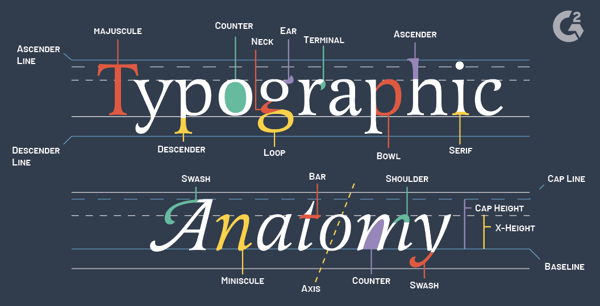
Part 2 - The Anatomy of Typography
Letterforms Analysed
For today's further reading, I choose to continue with typographic
design: Form and Communication by Rob Carter, Chapter 2 - The Anatomy of
Typography. In this chapter, I explored the basic languages of
typography. Letterforms, the fundamental components of all typographic
communications, are carefully, examined.
Typography evolved from handwriting, which is created by making a series
of marks by hand; therefore, the fundamental element constructing a
letterform is the linear stroke.

Figure 2.1 -
Strokes made with a reed pen(top), with a brush (middle), and with a
chisel (bottom).

Figure 2.2 -
capital letterforms have consisted of simple geometric forms based on
the square, circle and triangle.
The parts of letterforms

Figure 2.3 - Identify the major components of letterform
construction.

Figure 2.4 - Identify the major components of letterform
construction.
Proportions of the letterform
Four Major Variables Control Letterform Proportion:
1. Stroke-to-height ratio
Figure 2.5 - Stroke-width-to-capital-height proportion found on Roman
inscriptions.
In the adjacent rectangles, the centre letter is reduced to one-half
the normal stroke width, and the letter on the right has its stroke
width expanded to twice the normal width.
2. Contrast in Stroke Weight
Figure 2.6 -
The Development of Technology and Printing to make thinner
strokes.
In the Old Style typography of the Renaissance, since the writing pen
had a flat edge, stress is the term used to define the thickening of
the strokes, which is particularly pronounced on curves. By the late
1700s, the impact of writing declined, and this axis became completely
vertical in many typefaces. These typefaces have a moonlike stroke
that is completely even in weight.
3. Expanded and Condensed Styles
Figure 2.7 -
the word proportion, set in two sans serif typefaces,
demonstrates extreme expansion and condensation.
Although both words are exactly the same height, the condensed
typeface takes up far less area on the page.
4. X-Height and Proportion
The proportional relationship between the x-height and capital,
ascender, and descender heights influences the optical qualities of
typography in a significant way. Below are the same characters are set
in 72-point type using three typefaces with widely varying
x-heights.
Figure 2.8 - demonstrating how the proportional relationships change
the appearance of the type.
Typographic Measurement
- Metal Type Measurement

Figure 2.18 -
Rectangular metal block of type has a raised letterform on top,
which was inked to print the image.

Figure 2.19 - Various sizes of type were identified by names
- Spatial Measurement

Figure 2.20 - smaller divisions of space are fractions of the em.
The Type Family

Figure 2.21 - The roman, bold, and italic fonts in the Baskerville
family.
- Weight Changes

Figure 2.22 -
In the Avant Garde family, stroke weight is the only aspect that
changes in these five fonts.
- Proportion.
Changing the proportions of a typestyle by making letterforms
wider (expanded) or narrower (condensed), as discussed
earlier, is another method for adding typefaces to a type
family. Terms used to express changes in proportion include:
ultraexpanded, extraexpanded, expanded, regular, condensed,
extracondensed, and ultracondensed.
- Angle

Figure 2.23 -
Baskerville Italic is a cursive, demonstrating the influence of
handwriting.

Figure 2.24 - Elaborations of Helvetica Medium

Figure 2.25 -
Gill Sans Shadowed is based on Gill Sans. A black shape, suggesting dimensionality, is placed behind each
letter.
- The Cheltenham Family
Variations developed by other typefounders and manufacturers of
typesetting equipment expanded this family to more than thirty
styles. The design properties linking the Cheltenham family are
short, stubby slab serifs with rounded brackets, tall ascenders
and long descenders, and a moderate weight differential between
thick and thin strokes.

Figure 2.26 - The most extensive type families - The
Cheltenham Family
- The Univers Family
Univers 55 is the “parent” face; its stroke weight and
proportions are the norm from which all the other designs
were developed. The black to white relationships and
proportions of Univers 55 are ideal for text settings.

Figure 2.27 - The Univers Family
The twenty-one members of the Univers family share the same x-height, capital height, and ascender and descender length and are produced as a system, they can be intermixed and used together without limitation. This gives extraordinary design flexibility to the designer.

Figure 2.28 - Typographic interpretation of the "The Bells"
using the Univers Family.
Summary:
In today's further reading is boring than the previous
section, as it has been taught in Mr. Vinod class. This book
further elaborate the development of Typography, allow readers
or designer have the basic concept of typography design and
the abilities to select an appropriate typefaces. It teaches
readers to differentiate the stroke, ratio, angle ,
proportions and etc.. In this section, I think
Historical Classification of Typefaces is the part
where I prefer to read more, although I still unable to
differentiate that much of the typefaces out there.
QUICK LINKS
Special Task:
Type Design & Communication (AngPow Design)


.jpg)